Visual intro
Let's discover Plotyl JS visual in 5 min.
What you'll need
- Power BI Desktop or Power BI Service:
- Microsoft work account under an organization's email
- Sample or your own dataset
Getting Started
-
Import the visual from Appsource in Power BI Desktop.
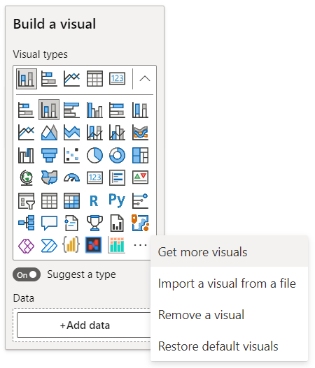
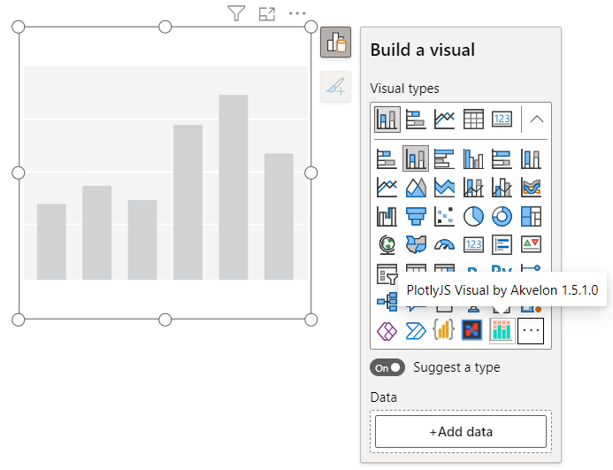
On the Visualizations pane, click on
...and selectGet more visuals -
Type
PlotlyJSin the search bar to find the visual: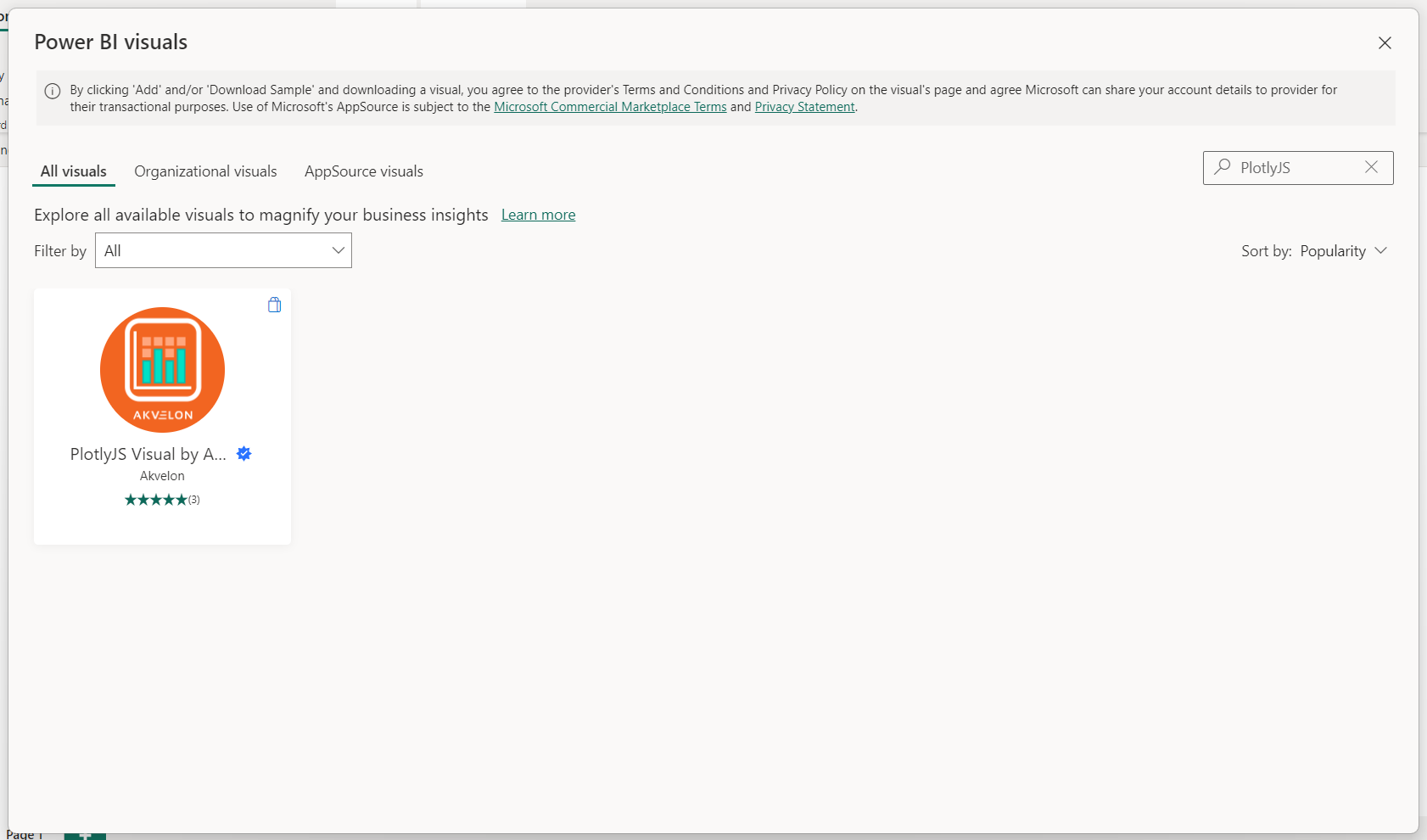
Then click on the PlotlyJS Visual icon to open the visual page.
-
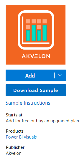
Click on
Addto load the visual into Power BI Desktop. -
Switch the visual to PlotlyJS Visual by clicking on the PlotlyJS Visual icon.
-
Assign data to the visual:
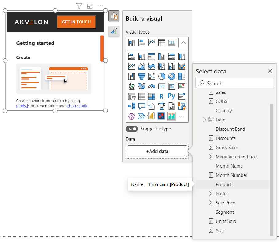
Click on
+Add dataunder the Data section of the panel and select columns from the table that you would like to be included in the visualization. -
Switch to edit mode by clicking on
...to open the visual menu and selectingEdit.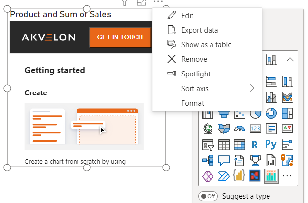
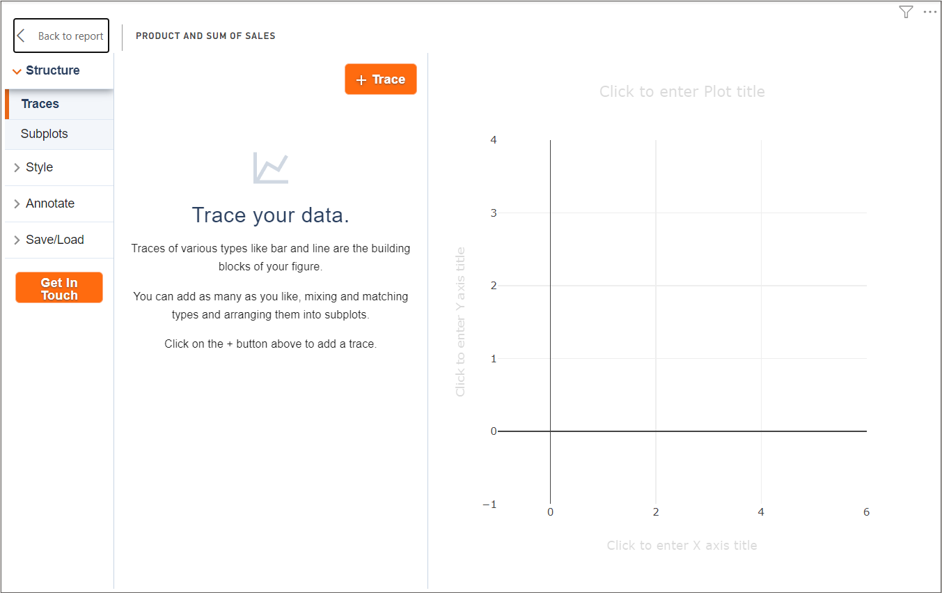
The visual will open in focus mode and will launch Chart studio.
Configuring the Simple Chart
-
Click on the
+Tracebutton to start configuring the chart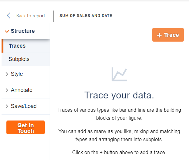
-
Switch the trace by clicking on
Scattertype: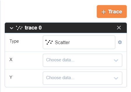
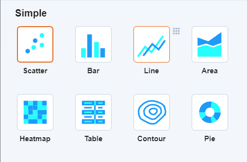
-
Select the Line chart:
-
Assign columns to
XandYaxes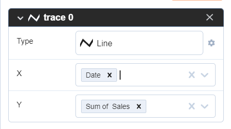
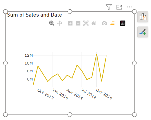
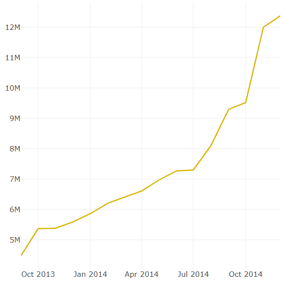
The result:
-
Save the chart by selecting
Save/load/JSONtab and clicking on theSavebutton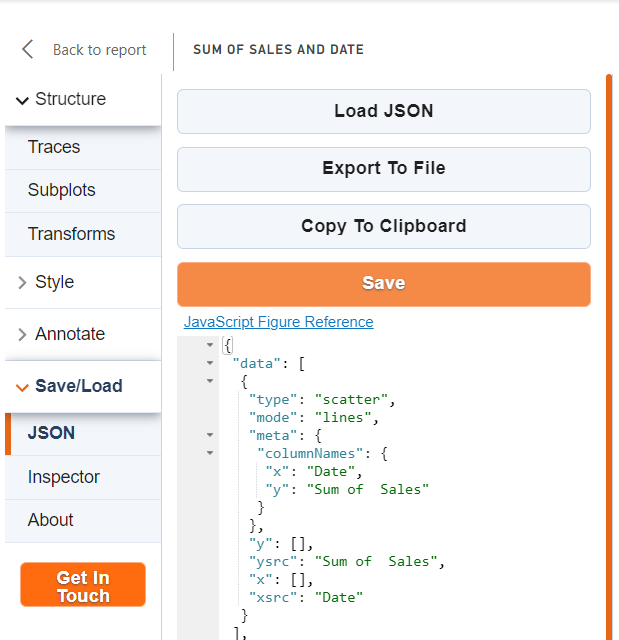
-
Click on the
Back to reportbutton to exit from the Chart studio and see the result: