Sankey tutorial
The visuals allows the creation of Sankey charts. This is creating a sample chart and preparing data in Power BI Desktop for rendering Sankey chart by PlotlyJS Visual.
In this tutorial SankeyMicrosoftSample report was used for data imported from Microsoft Sankey visual sample report.
Prepare data
To set node labels on the chart correctly, you have to transform your table to the next state:
| Source | Destination | Value | SourceIndex | DestinationIndex | NodeLabel |
|---|---|---|---|---|---|
| Angola | China | 5 | 0 | 17 | Angola |
| Angola | India | 1 | 0 | 18 | Brazil |
| Angola | Japan | 3 | 0 | 19 | Canada |
| Brazil | England | 1 | 1 | 3 | England |
| Brazil | France | 1 | 1 | 5 | England South |
| Brazil | Portugal | 5 | 1 | 10 | France |
| Brazil | Spain | 1 | 1 | 14 | France South |
| Canada | England | 1 | 2 | 3 | Mali |
| Canada | France | 5 | 2 | 5 | Mexico |
| Canada | Portugal | 1 | 2 | 10 | Morocco |
| England | Angola | 1 | 3 | 0 | Portugal |
| England | Morocco | 2 | 3 | 9 | Portugal South |
| England | Senegal | 1 | 3 | 12 | Senegal |
| England South | South Africa | 5 | 4 | 13 | South Africa |
| France | Angola | 1 | 5 | 0 | Spain |
| France | Mali | 3 | 5 | 7 | Spain South |
| France | Morocco | 3 | 5 | 9 | USA |
| France | Senegal | 3 | 5 | 12 | China |
| France South | South Africa | 2 | 6 | 13 | India |
| Mali | China | 5 | 7 | 17 | Japan |
| Mali | India | 1 | 7 | 18 | France1 |
| Mali | Japan | 3 | 7 | 19 | Africa China |
| Mexico | England | 1 | 8 | 3 | Africa India |
| Mexico | France | 1 | 8 | 5 | Africa Japan |
| Mexico | Portugal | 1 | 8 | 10 | |
| Mexico | Spain | 5 | 8 | 14 | |
| Morocco | China | 5 | 9 | 17 | |
| Morocco | France1 | 11 | 9 | 20 | |
| Morocco | India | 1 | 9 | 18 | |
| Morocco | Japan | 3 | 9 | 19 | |
| Portugal | Angola | 2 | 10 | 0 | |
| Portugal | Morocco | 1 | 10 | 9 | |
| Portugal | Senegal | 1 | 10 | 12 | |
| Portugal South | South Africa | 4 | 11 | 13 | |
| Senegal | China | 5 | 12 | 17 | |
| Senegal | India | 1 | 12 | 18 | |
| Senegal | Japan | 3 | 12 | 19 | |
| South Africa | Africa China | 1 | 13 | 21 | |
| South Africa | Africa India | 2 | 13 | 22 | |
| South Africa | Africa Japan | 3 | 13 | 23 | |
| Spain | Morocco | 3 | 14 | 9 | |
| Spain | Senegal | 1 | 14 | 12 | |
| Spain South | South Africa | 4 | 15 | 13 | |
| USA | England | 5 | 16 | 3 | |
| USA | France | 1 | 16 | 5 | |
| USA | Portugal | 1 | 16 | 10 | |
| USA | Spain | 1 | 16 | 14 |
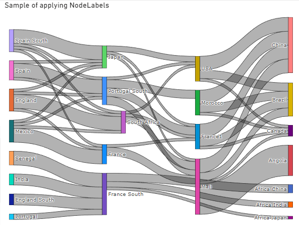
There is 'NodeLabel' column with labels for a node with unique values on top (it’s crucial to build Sankey properly).
We need to add an Index column to the source table 'SankeyMicrosoftSample'; the index will use as a foreign key to join with the source column.
To add node names, we need to apply a query to 'SankeyMicrosoftSample'. Let’s overview each row step by step to understand it.
let
	// We use “SankeyMicrosoftSample” table as a source
	Source = SankeyMicrosoftSample,
	// Then we create two tables, one for source nodes, and another for destination nodes
	// Remove all columns except the “Source” column
	DestinationNodes = Table.RemoveColumns(Source,{"Source", "Value", "NodeLink"}),
	// Then rename it to the “Nodes” column.
	DestinationNodesRanmed = Table.RenameColumns(DestinationNodes, {{"Destination", "Nodes"}}),

	// Do the same for Destination nodes.
	// Remove all columns except the “Destination” columns.
	SourceNodes = Table.RemoveColumns(Source,{"Destination", "Value", "NodeLink"}),
	// Then also, rename it to the “Nodes” column.
	SourceNodesRenamed = Table.RenameColumns(SourceNodes,{{"Source", "Nodes"}}),

	// Because we need only one column with all node labels, combine those two tables with “Node” columns
	Combination = Table.Combine({SourceNodesRenamed, DestinationNodesRanmed}),
	// Then get distinct values by applying Table.Distinct function
	DistinctNodes = Table.Distinct(Combination),
	// To join with the  source column,
	// Add an Index column to our Table with distinct “Nodes” table
	NodesList = Table.AddIndexColumn(DistinctNodes, "Index", 0, 1, Int64.Type),

	// The last step is to join two tables (SankeyMicrosoftSample, NodesList)
	LeftJoin = Table.AddJoinColumn(SankeyMicrosoftSample, "NodeLink", NodesList, "Index", "NodeLabel"),
	// Expand the NodeLabel column. It doesn’t need an index column from the NodesList table.
	Expand = Table.ExpandTableColumn(LeftJoin, "NodeLabel", {"Nodes"}, {"NodeLabel"}),

	// Add IDs for source and destination node because PlotlyJS expects numbers instead of string
	// Add SourceID
	SourceID = Table.AddJoinColumn(Expand, "Source", NodesList, "Nodes", "SourceID"),
	// Expand the table to get SourceID column only
    ExpandedSourceID = Table.ExpandTableColumn(SourceID, "SourceID", {"Index"}, {"SourceID"}),

	// Add DestinationID
	DestinationID = Table.AddJoinColumn(ExpandedSourceID, "Destination", NodesList, "Nodes", "DestinationID"),
	// Expand the  table to get DestinationID column only
    ExpandedDestinationID = Table.ExpandTableColumn(DestinationID, "DestinationID", {"Index"}, {"DestinationID"})

	// Return result
in
	ExpandedDestinationID
Configure Sankey chart in PlotlyJS chart
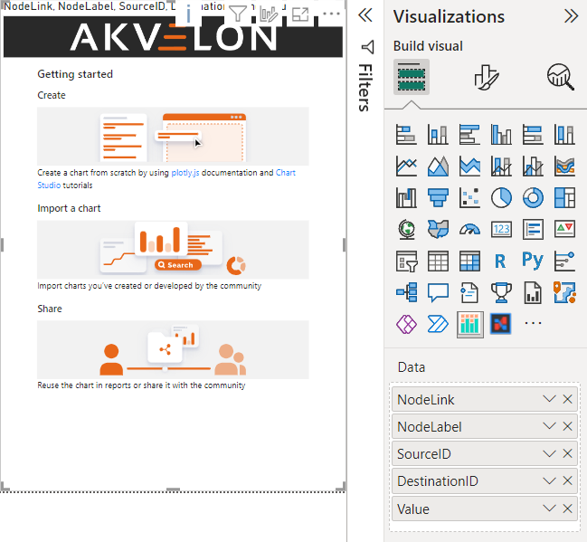
When data is ready, create the visual instance on a report page and assign NodeLink, NodeLabel, SourceID, DestinationID, and Value columns to the visual instance:
Enter edit mode by clicking on Edit in the visual menu and click +Trace:

Then switch trace type Sankey by selecting trace on the list.
The last step is assigning columns to properties:
NodeLabel to Labels
SourceID to Sources
DestinationID to Target
Value to Values
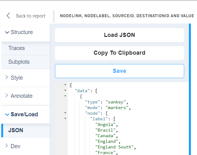
and save the chart in the Save/Load tab:
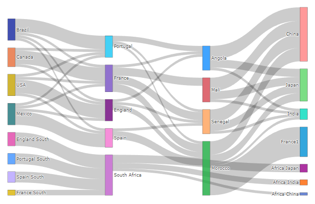
The final result is: