Highlights
Highlights on the visual allow showing sections of data related to selected data points in other visuals.
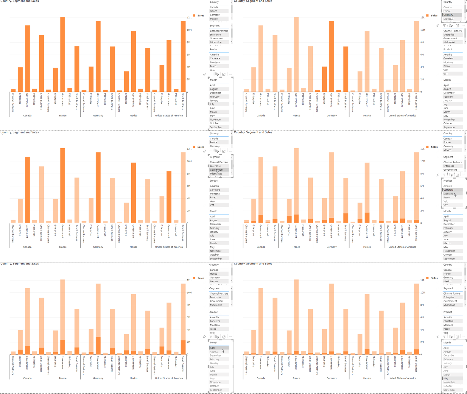
To create such visualization in the PlotlyJS Visual, the visual provides highlighted values as a regular column of the table:
The values of those columns always are less than the values of the corresponding un-highlighted columns.
To add highlights for charts, you need to enable the property in the visual settings:
Then create the second bars behind and assign different columns (highlight and values columns) for them.
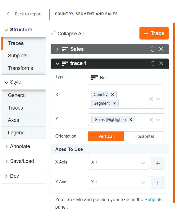
Click on “+ Trace” to add a new trace to the chart:
New trace:
Assign Country and Segment columns to X axis. Assign Sales (Highlights) to Y axis.
After that, you will have a chart with new columns:
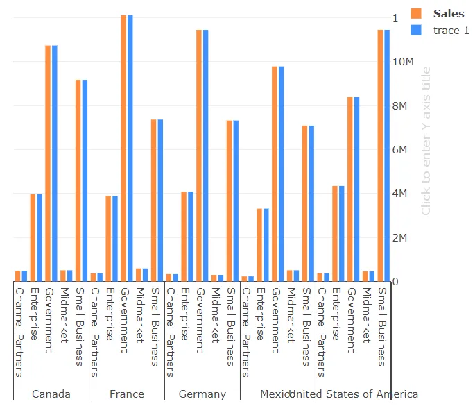
Change the opacity of the first trace in the styles section:
Those bars will be behind the chart to visualize the un-highlighted values.
Add the new X axis for the second trace (Name is trace 1) in the Trace tab of the editor in the Axes to Use panel:
After that, the chart shifts the trace 1 to the foreground and adds the second X axis on top:
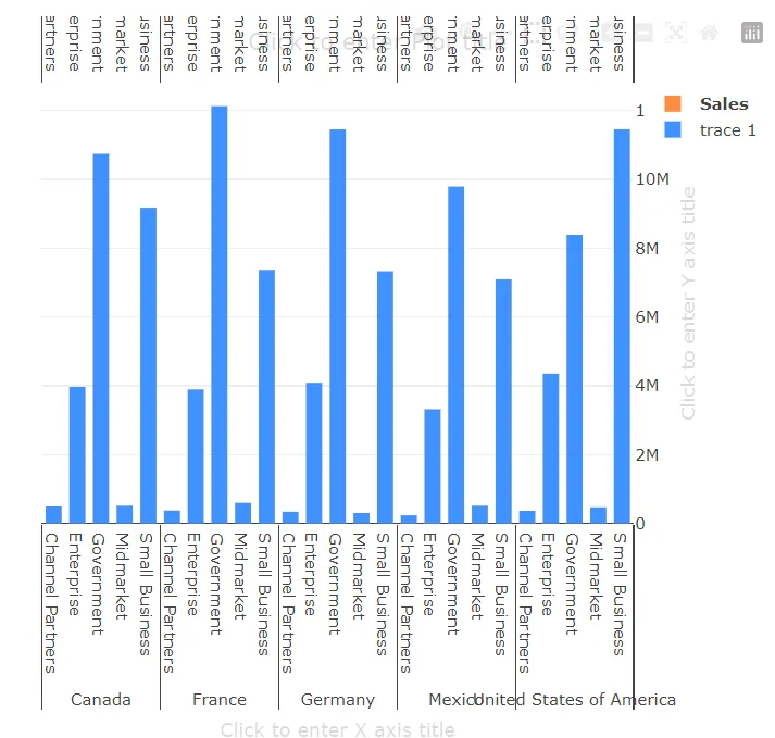
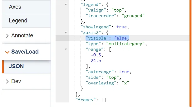
We don’t need the second X axis (xaxis2) for hiding it, you just need to set false for the “visible” property in the JSON editor:
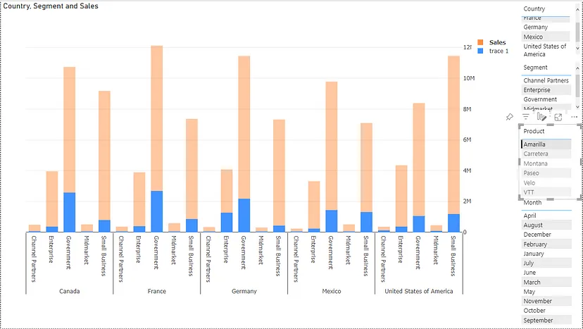
It almost ready — you can save and interact with other visuals in the Power BI report to see the result:
The final part is color — you need to set the same color for the second trace too in the “Styles” tab:
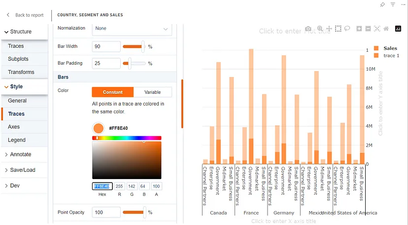
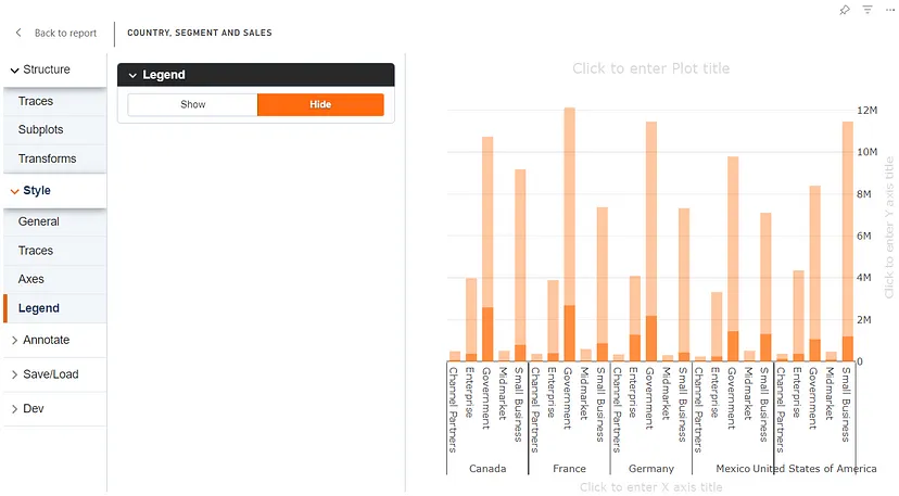
Hide the legend, as we don’t need it here for single trace:
